THE PROBLEM
When it comes to creating an account or logging into one, students have stressed that the process can feel tedious and overwhelming. Some registration and login systems maintain a list of requirements, ask a hefty number of questions, or follow an overpowering aesthetic. These concerns introduced a new design question:
How can we transform the common login and registration experience to help students feel at ease while saving time and energy?
THE SOLUTION
-
Reducing security formatting requirements
Some registration processes adhere to specific rules and restrictions for formatting newly created usernames and passwords. Users have expressed that this requirement to follow a particular formatting style feels strict and cumbersome. So long as usernames are 3-15 characters and passwords are at least 8 characters in length, we're good to go.
-
Shortening the registration process
Hefty number of questions during the registration process can exasperate users. Narrowing down the registration process to 3 easy steps (username, password, and email) makes for a simple and straightforward signup.
-
No context switching after logging in
Some platforms require users to confirm their identity via email after logging into an account. Students have expressed frustration towards undergoing an additional step to log back into their email account only to confirm their credentials. Instead of creating an additional step for users to confirm their identity, we can quickly verify a user's identity via Face or Touch-ID.
-
Quickly log in via facial or fingerprint authentication
Typing out login credentials one-by-one can feel taxing and burdensome. For an effortless login, users have the option to access their account within seconds with a quick facial or fingerprint scan.
-
Simple account recovery
Recovering an account after forgetting a password can be an unncessarily complicated and stressful process. To save users' worries, they can easily recover their account with just email address and a confirmation of their identity.
-
Clean and easy-to-read interface
Opted-in for a clean and simple aesthetic with soft shades for a tranquil feel. Additionally, made liberal use of white space to improve readability and organization of design elements.
RESEARCH AND ANALYSIS
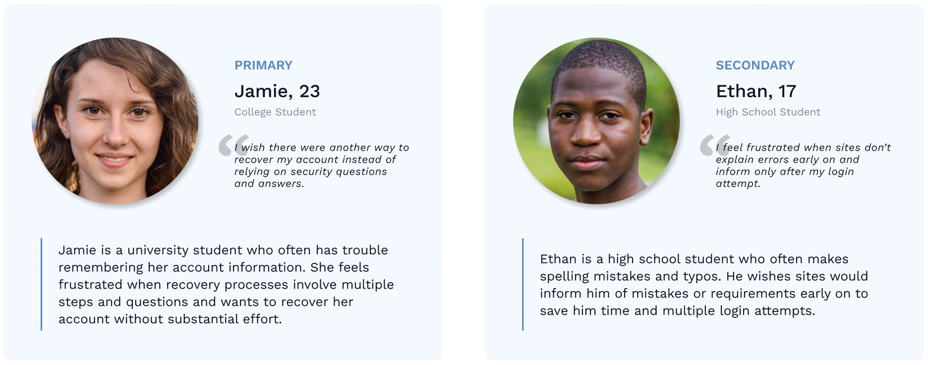
At this stage, my goal was to gather a clear idea of my project concept, as well as an understanding of my users' goals, study habits, and needs. I began researching the top competitors, trends, and target market of focus tracking apps, and based on the data I collected, I built an emapthy map surrounding my ideal user. By creating an intial emapthy map, I was able to gain a deeper inisght into my ideal user and visually articulate what I knew about them. I then searched for users within my target demographic and interviewed students to gather their mental model and any pain points that my project may need to address. After gathering a better understanding of my interviewees' experiences, perceptions, and pain and gain points, I built 3 specific user personas to illustrate who my target market really is.
INFORMATION ARCHITECTURE
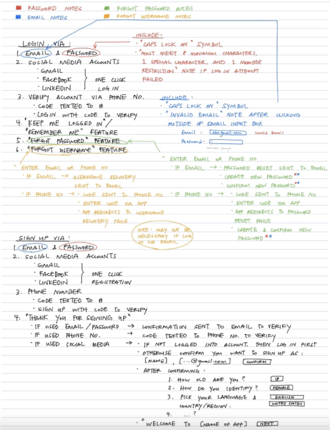
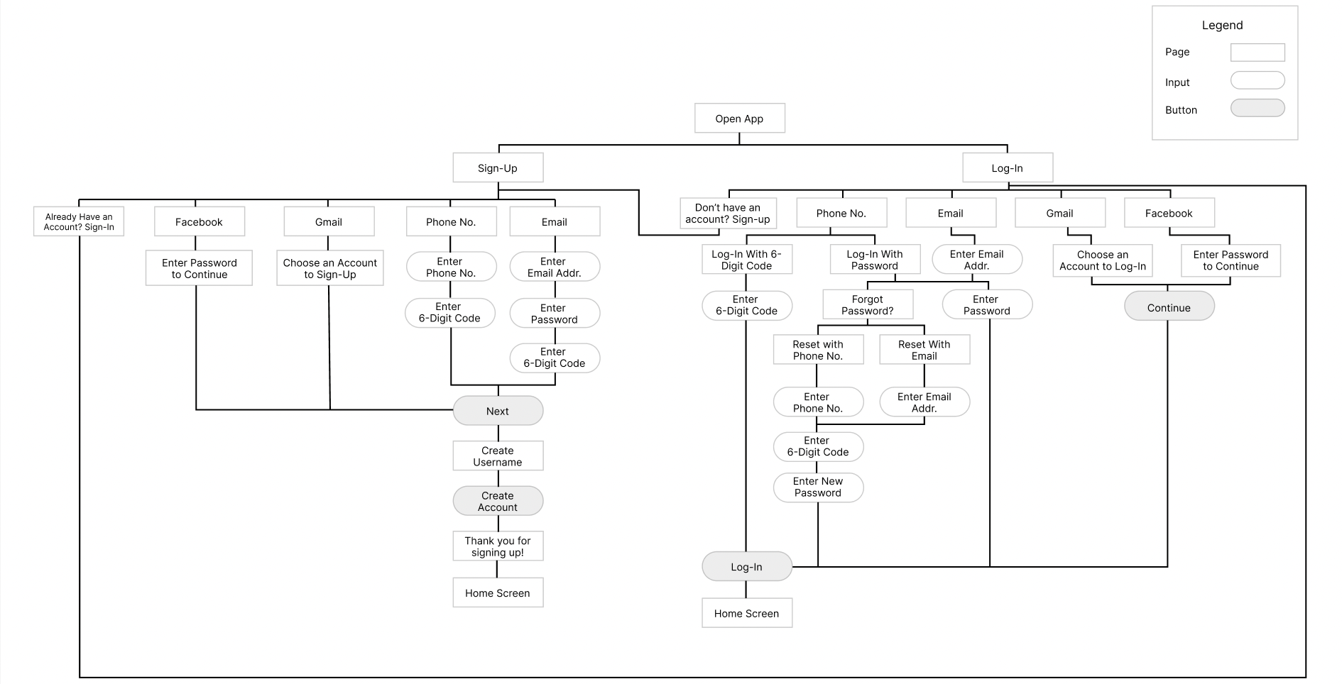
To visualize the usability of Pomolo's onboarding process, I outlined its initial scope and information architecture. Since users stressed the monotonousness of current signup and login forms, my goal was to minimize the number of steps it took to complete a task in order to avoid a tedious experience. With this objective in mind, I identified critical features, strategies, and potential edge cases that would be essential to each task (i.e. registering, logging in, and recovering a username or password). This approach allowed me to filter any unnecessary steps and condense each task to simplify and accelerate registration and login forms.
Site Map Sketches:
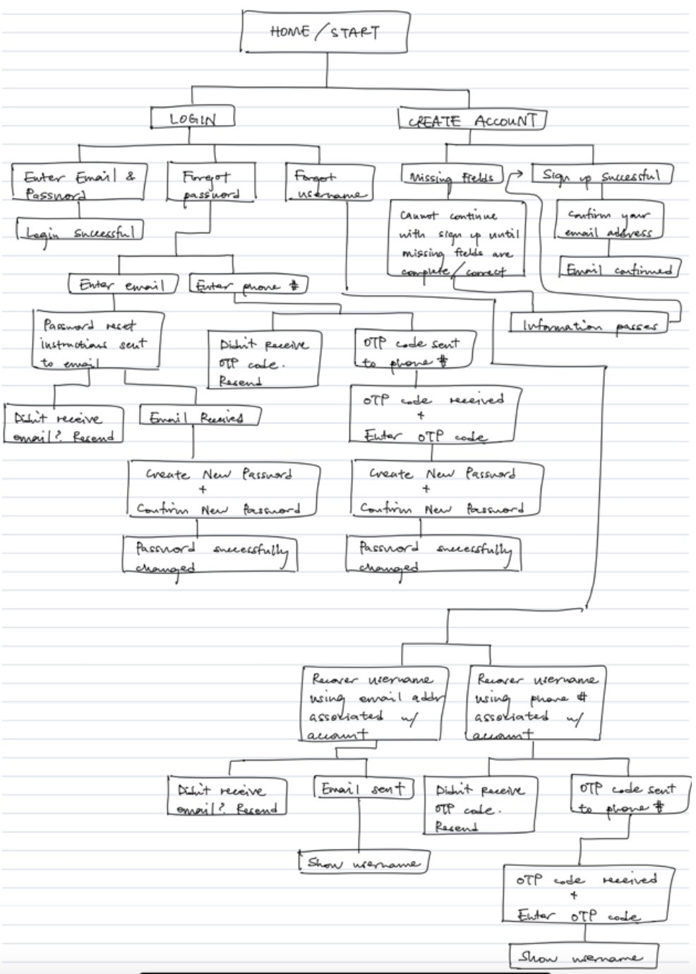
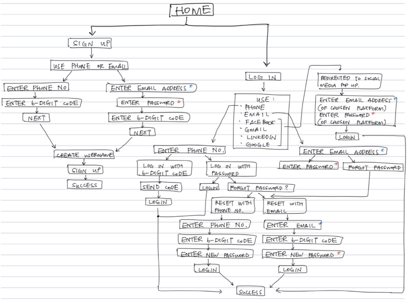
Site Map:
LOW-FIDELITY WIREFRAMING
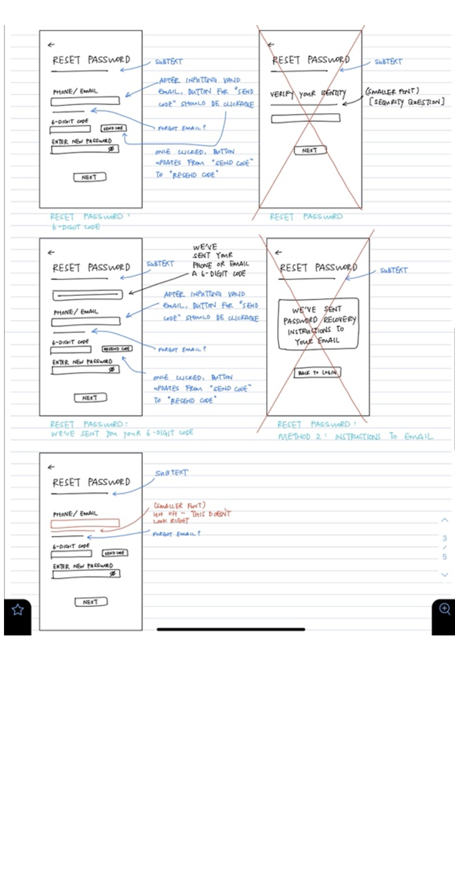
During this phase, I updated my site map based on past peer-to-peer testing critiques and focused on designing core pages to delineate content concepts and layouts. I then outlined a list of possible edge cases and integrated the userflow by designing a responsive page for each.
Low-Fidelity Sketches:
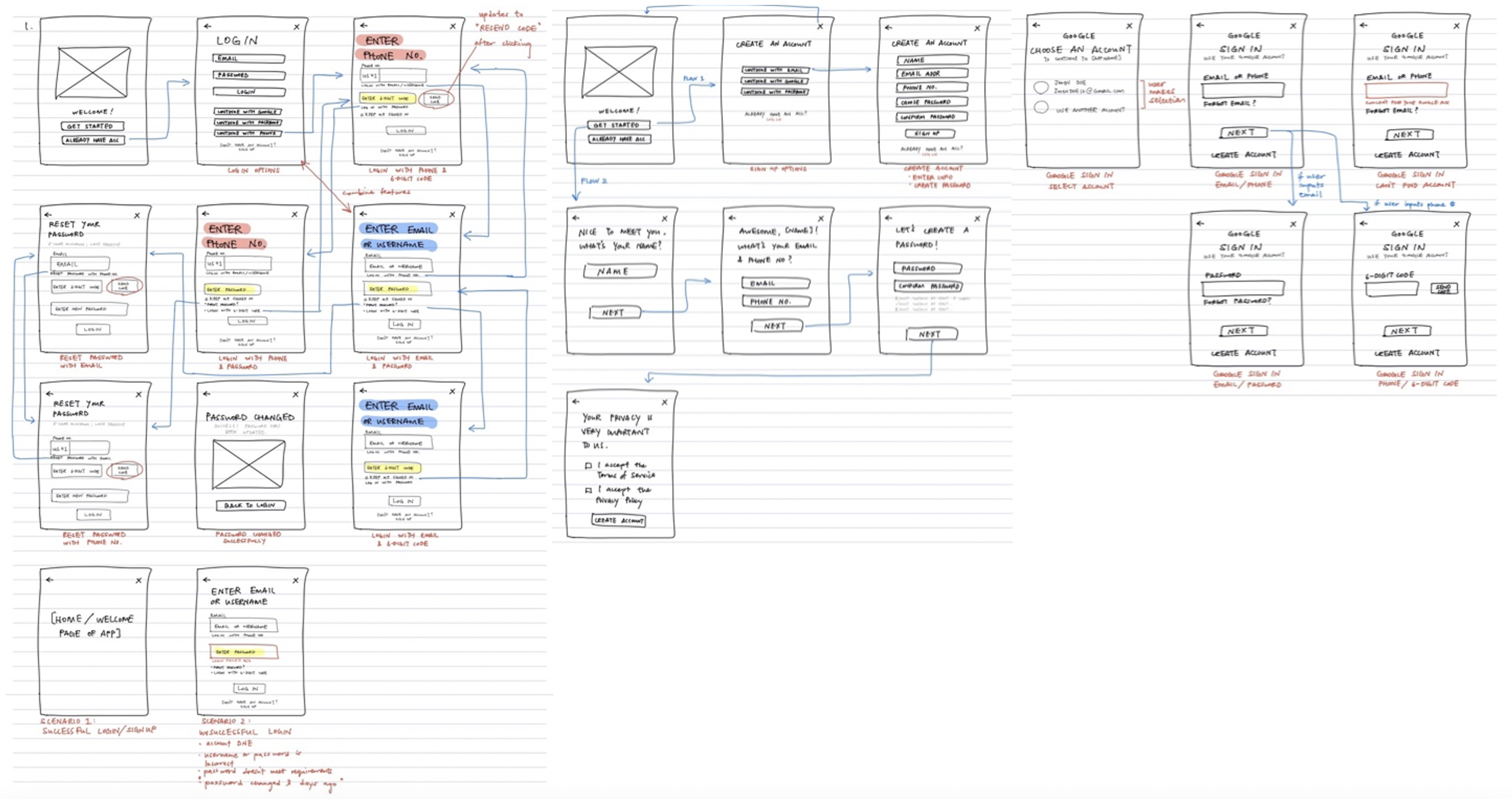
Low-Fidelity Wireframes:

LOW-FIDELITY TESTING
Before presenting my wireframes, I introduced my concept and surveyed for users' user journeys, preferences, and goals to gain clarity on big-picture beliefs and ideas. I then field tested and explored initial layout concepts with my interviewees to gauge their first impressions of each page. Based on the user testing and class critiques I received, I updated my wireframes and compiled the remaining of the responsive pages.
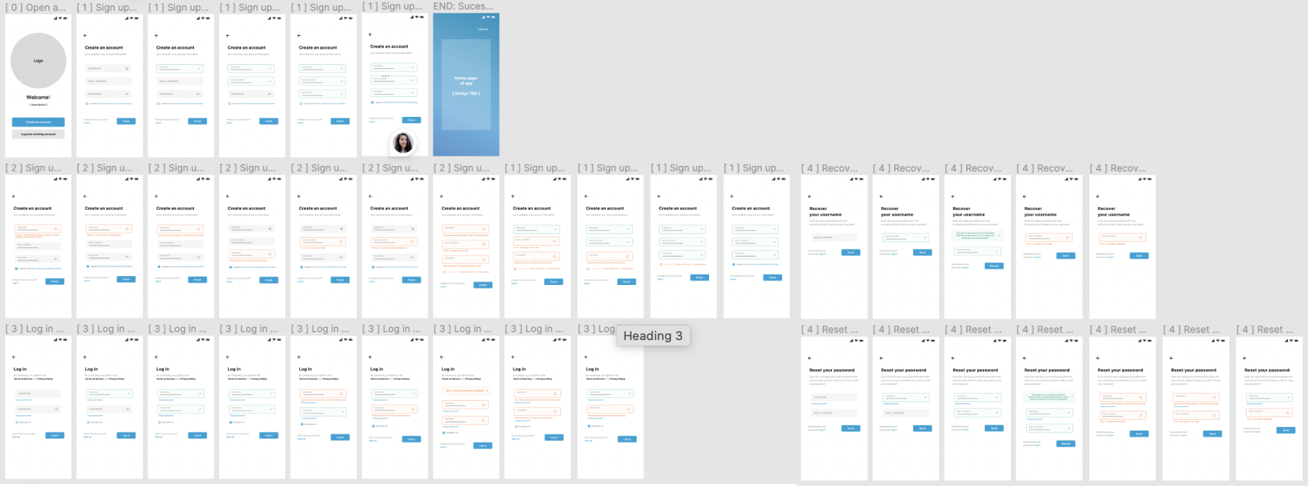
(Updated) Low-Fidelity Wireframe Sketches:
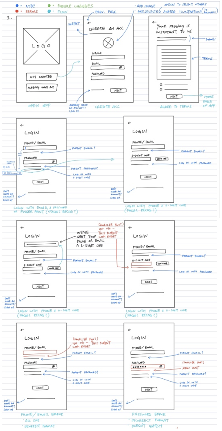
(Updated) Low-Fidelity Wireframes:
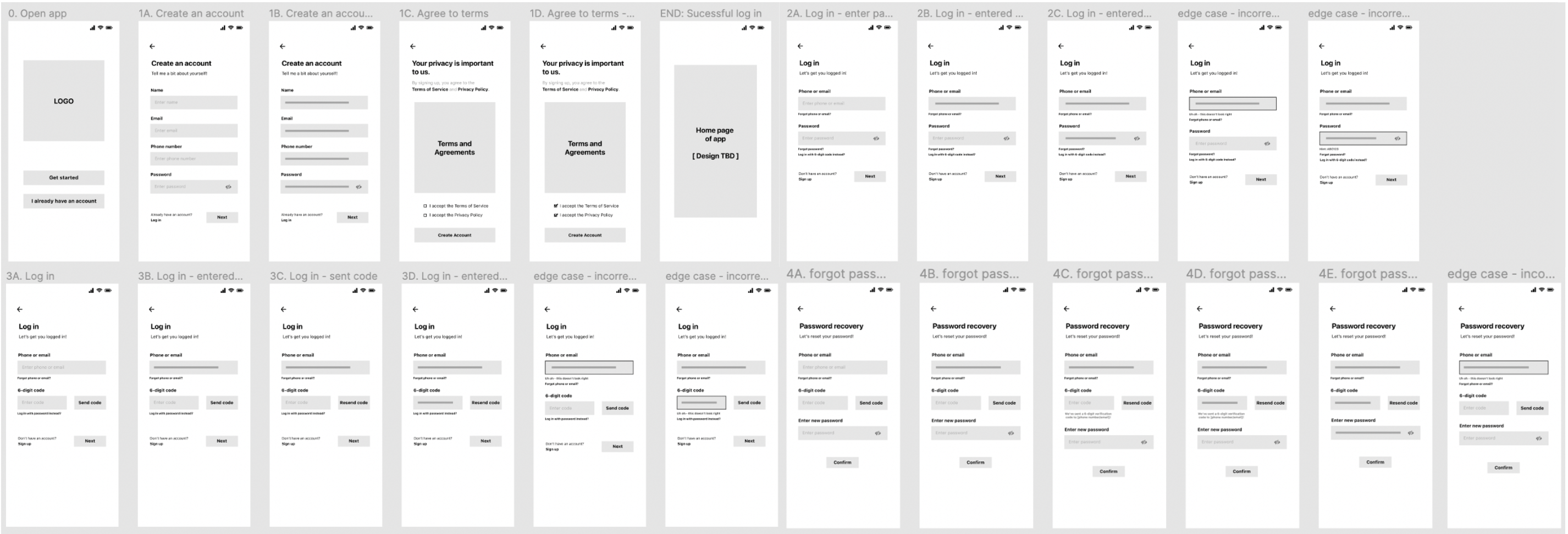
MID-FIDELITY WIREFRAMING & TESTING
After integrating color schemes and visuals, I reinterviewed past users to mine for their mental models and tested the updated design's usability. Users were asked to complete 4 tasks on their own (signing up, logging in, recovering a username, and resetting a password), and during this process, I documented their experience, task success rate, and suggestions for improvement. Overall, users were able to navigate and pass every task on their first attempt. By conducting my interviews early on, I managed to reveal any need for design updates ahead of time and implemented these changes accordingly.
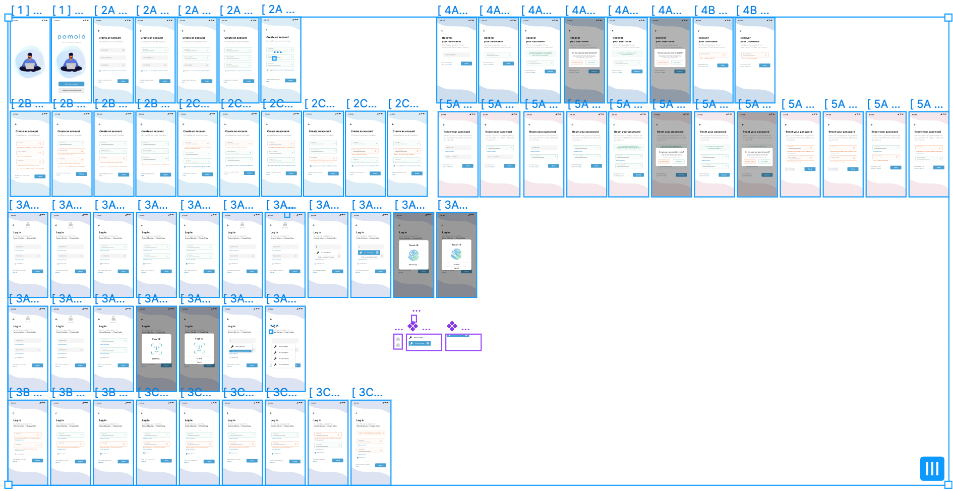
HIGH-FIDELITY WIREFRAMING & TESTING
At this stage, my main focus was testing the updated prototype's usability and performing one last round of testing. To visualize a real-world and initial interaction, I provided my interviewees with the same 4 tasks to complete on their own. Based on the final critiques and findings I received, I integrated any necessary changes to a newly updated prototype.
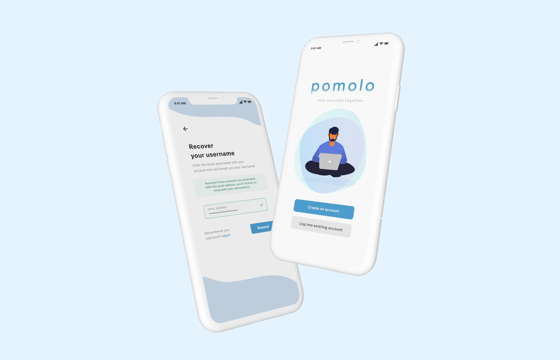
FINAL DESIGNS
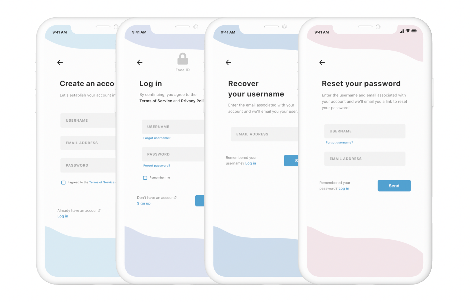
Quick and Simple Signup
A simple 3-field registration that asks only the most necessary of information. By shortening the signup process, Pomolo will help users save time and effort, and leave less room for error.
Log in With Face and Touch-ID
Instead of typing each individual field, users can quickly and securely verify their identity with facial recognition or a touch of a fingerprint.
Easy Account Recovery
No need to memorize a list of security questions or answers; in just 2 steps, users can recover their username and reset their password using only an email address or username.
Instant Notification of Errors
If users input information that's incorrectly formatted or doesn't meet guidelines, they'll be immediately notified to save multiple login attempts and effort.
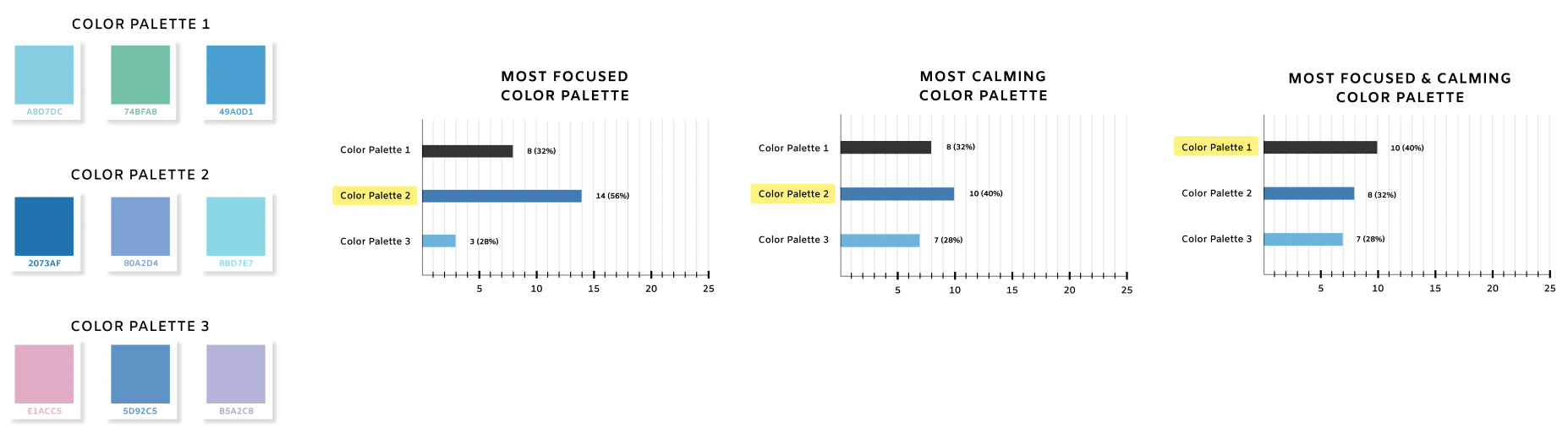
STYLE GUIDE
When users were asked what colors came to mind for focus tracking apps,
a majority preferred blue and green tones.
Based on this feedback, I created 3 different color palettes containing
shades of blue, green, and purple and surveyed 25 users.
Overall, users found color palette 1 to be the most peaceful and
concentrating for study and work environments.
The blue's evoke a sense of calmness and serenity while the
green expresses hope and growth.
Pairing the two tones felt like the perfect fit for Pomolo as
it brought forth a sense of tranquility and invigoration.
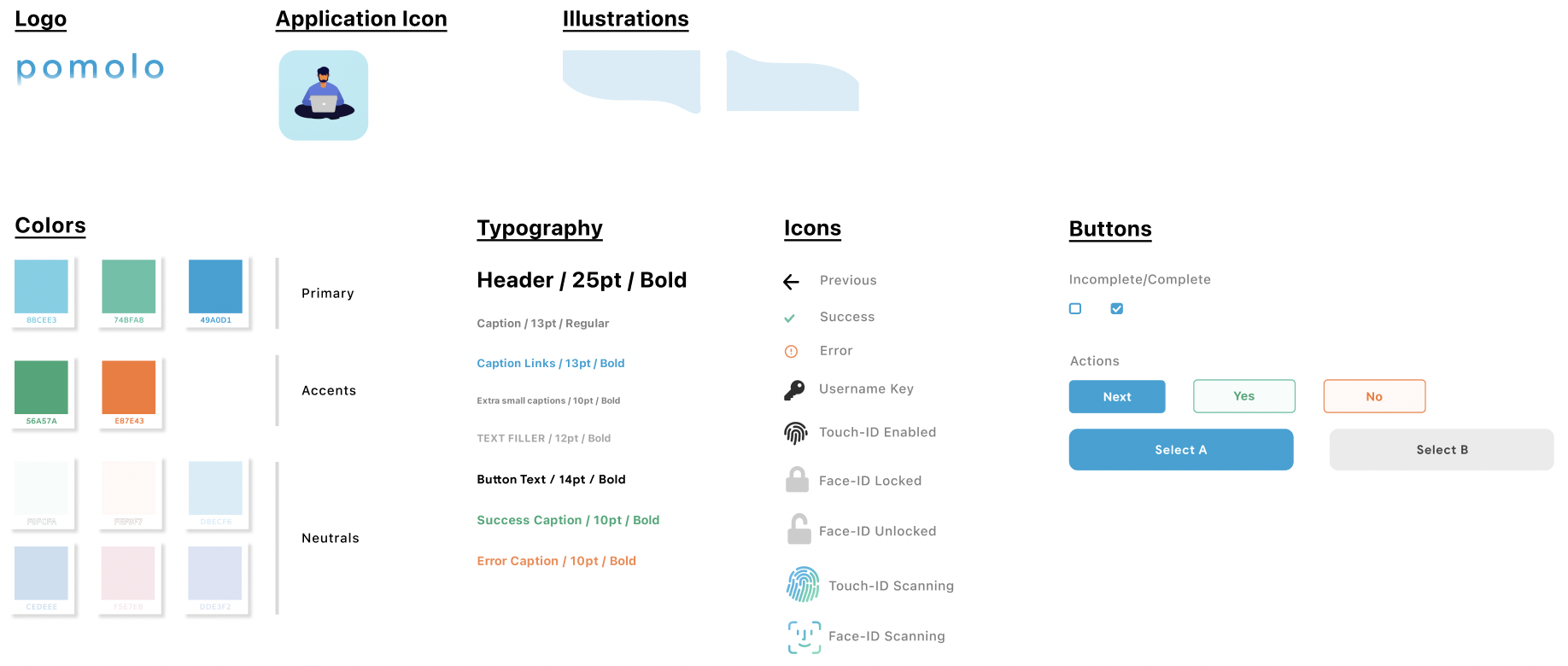
As for Pomolo's typeface, I decided on SF Pro for it's
clean and contemporary style, as well as its versatility for
different text fills and characters.
TAKEAWAYS
This was my first solo UX case study, and prior to this project, I thought I knew all the nuts and bolts to a successful registration and login experience. Little did I know, I'd embark on a journey that’d require extensive user research, iterations, and testing to develop a product with intentional designs and solve identified issues. I learned so much about how to build a successful product from start to finish, understanding user motivations, conducting usability tests, and designing a product with a specific intention. The main lessons I've taken away from this experience include:
-
Don't be afraid of user research
Before taking this class, the thought of directing user interviews was incredibly nerve-wracking. However, at the end of every session, I was consistently reminded of how much I loved connecting with people. User interviews felt more and more natural, and became something I looked forward to doing. Rather than viewing the experience as a formality, I found it helpful to view it as a conversation between friends. Take it from me - to get comfortable at something, you've got to start getting uncomfortable, and the more testing you do, the less daunting it'll seem!
-
Get to know your users
User research isn't only about improving your designs, it’s also about getting to know your users! Take this opportunity to learn about how your users think, understand where they’re coming from, and remove any biases. Don’t limit yourself to only focusing on identifying pain points or what can be done to improve your designs. If you can step into the mindset of your user, then you'll be able to deliver the best possible product to meet their needs.
-
Keep iterating
Always try out multiple solutions! By consistently refining your work early on, you make critical changes, resolve hidden issues, and ensure your product meets its functionality and usability goals.